Toltek
Identity
Identity
Toltek is a French data intelligence company redefining how people and data work together. The new identity centers on the idea of collaboration: technology and human insight operating in sync.
The symbol is built from a modular grid where each node represents connection. This “t” balances geometric precision with soft, rounded forms, expressing Toltek’s dual nature: sharp in logic, human in approach.
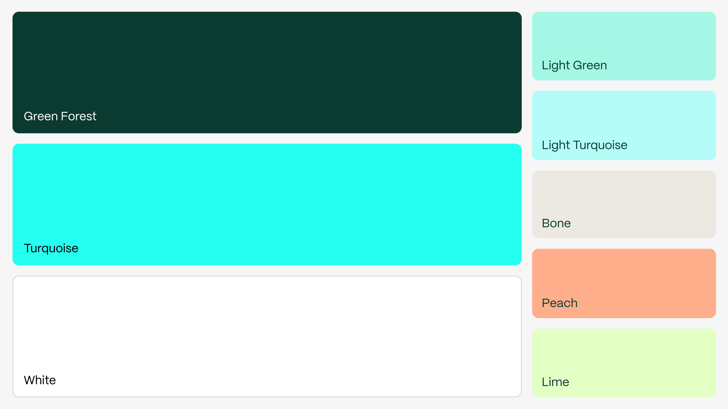
A palette led by Forest Green and Turquoise creates a calm, contemporary tone, distancing the brand from the coldness typical in the tech sector. The Mori typeface supports this with quiet structure and subtle character.
The result is a visual system that feels intelligent, composed, and deeply human—reflecting Toltek’s mission to turn connection into clarity and collaboration into progress.


